
UI/UX Design Fixes That Help SME Websites Convert Better
Key Takeaways
- UI/UX is about making a website easier for customers to use, not just making it look attractive.
- Small friction points can reduce enquiries even when a website appears professional.
- Navigation, calls-to-action, forms, and mobile usability are often the biggest conversion barriers.
- Mobile experience should be treated as a priority, not an afterthought.
- Improving website conversions often comes down to making it easier for visitors to understand, trust, and contact your business.
A Good-Looking Website Does Not Always Generate More Enquiries

Many SME websites look modern, professional, and visually appealing, yet still struggle to generate enquiries. The problem is often not the appearance of the website itself, but the experience visitors have while using it.
A potential customer may land on your website and immediately wonder:
- Where do I find the information I need?
- Which service is relevant to my business?
- Why should I choose this company?
- How do I get in touch?
If those questions are not answered quickly, visitors may leave before taking action.
This is where UI and UX become important. User Interface (UI) refers to the visual elements people interact with, such as menus, buttons, layouts, and forms. User Experience (UX) focuses on how easy and intuitive the entire journey feels.
Working with a professional UI/UX design agency in Singapore should not only result in a better-looking website. It should also help remove confusion from the customer journey, making it easier for visitors to understand your business and move towards an enquiry.
The good news is that improving conversion rates does not always require a complete website rebuild. In many cases, a few targeted improvements can significantly improve how visitors engage with your website.
Start with Simple, Customer-Centred Navigation

Navigation is one of the first indicators visitors use to judge whether a website is easy to work with.
If menus are cluttered, confusing, or organised around internal company structures instead of customer needs, visitors may struggle to find the information they came for. Most people will not spend time figuring out a complicated website. They will simply leave.
The most effective navigation structures reflect how customers think.
Visitors are typically looking for:
- Services
- Industries served
- Previous work
- Company information
- Contact details
Labels should be clear and familiar. Avoid creative menu names that require explanation. While they may seem unique internally, they often create unnecessary friction for first-time visitors.
A useful test is simple: can a new visitor identify where to click within five seconds?
If the answer is no, your navigation may need restructuring.
Businesses investing in website design and development should ensure navigation planning is treated as a strategic exercise rather than a visual one. Well-structured navigation improves usability, supports SEO, and helps visitors feel confident about engaging with your business.
Make Calls-to-Action Clear and Easy to Find
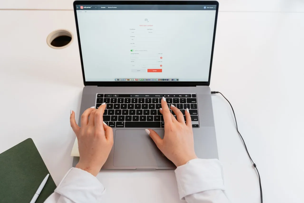
Unfortunately, many SME websites either hide CTAs, use vague wording, or overwhelm visitors with too many competing actions.
Buttons such as “Submit” or “Learn More” provide little context. Visitors should immediately understand what will happen when they click.
More effective examples include:
- Request a Quote
- Schedule a Consultation
- View Our Work
- Contact Our Team
- Download the Guide
The best CTAs align with the visitor’s level of intent.
Someone who has already reviewed your services may be ready to request a quotation. Someone still researching may prefer to explore examples of your work or learn more about your process.
Good website design considers both placement and context. CTAs should appear naturally after key information, beside proof points, and at logical decision-making moments throughout the page.
Visual design also plays an important role. Buttons should stand out without overwhelming the page. Proper spacing, colour contrast, and hierarchy help guide attention towards the actions that matter most.
Reduce Friction at the Point of Enquiry

Many businesses lose potential leads at the enquiry stage.
Visitors may be interested in your services but abandon the process because the form feels too long, complicated, or intrusive.
For most SMEs, simple forms perform best.
A typical enquiry form often requires only:
- Name
- Email address
- Phone number
- Company name (if relevant)
- Brief message
Every additional field creates additional effort.
The objective should be to collect enough information to respond effectively without making the process feel like an application form.
This is where thoughtful website maintenance becomes valuable. Regular reviews of form completion rates, user behaviour, and technical performance can reveal small issues that quietly reduce conversions over time.
Mobile usability is especially important here. Form fields should be easy to tap, validation messages should be clear, and users should receive confirmation after submission.
A simple message such as “Thank you for your enquiry. Our team will get back to you shortly” helps reassure visitors that their message has been received and sets expectations for the next step.
Treat Mobile as a Primary Customer Journey

Many business owners still review websites primarily on desktop computers.
Their customers often do not.
Today, many prospects first encounter a business website on their phones while commuting, attending meetings, responding to referrals, or comparing suppliers.
If the mobile experience is poor, the opportunity may be lost before the desktop version is ever seen.
Good mobile UX goes beyond shrinking desktop layouts.
It involves:
- Readable text without zooming
- Easy-to-tap buttons
- Simplified navigation
- Fast-loading pages
- Clear contact information
- Accessible enquiry forms
Every interaction should feel effortless on a smaller screen.
Businesses evaluating website design services in Singapore should pay close attention to how agencies approach mobile-first design. A strong mobile experience improves usability, increases engagement, and helps convert more visitors into enquiries.
When customers can quickly understand your services and contact your team from any device, your website becomes a more effective business tool.
Conversion Optimisation Is an Ongoing Process
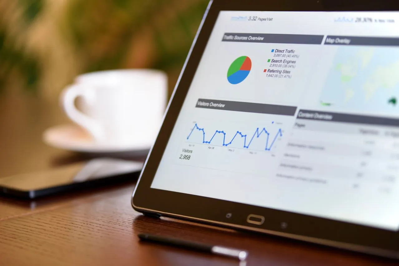
One of the biggest misconceptions about UI/UX is that it is completed when the website launches.
In reality, user behaviour changes over time.
As your business grows, new services are introduced, and customer expectations evolve, websites should be reviewed regularly to identify friction points.
Useful indicators include:
- High bounce rates
- Low enquiry rates
- Poor mobile engagement
- Low form completion rates
- Short visit durations
These metrics often reveal opportunities for improvement that may not be obvious from visual design alone.
A regular UX review can uncover small adjustments that deliver meaningful improvements without requiring a complete redesign.
Conclusion
Good UI/UX is about removing friction so visitors can understand your business and move forward with confidence. For SME owners and founders, that means focusing on practical areas: navigation, calls-to-action, forms, and mobile usability.
If your current website gets visitors but not enough enquiries, it may not need a full rebuild right away. Sometimes, a focused UX review can reveal small issues that are holding people back. A useful next step is to walk through your website as if you were a first-time customer and note every moment where the experience feels unclear, slow, or inconvenient.
Thinking about improving your website’s conversion rate? BlueCube Media helps SMEs identify and fix the design and UX gaps that quietly reduce enquiries. Visit our Agency page to learn more about us, or contact us to discuss your website goals.
FAQs for UI/UX Design for SMEs
What is UI/UX in website design?
UI refers to the visual interface of a website, such as buttons, layouts, colours, and menus. UX refers to the full user experience, including how easy it is for visitors to find information and take action.
Why does UI/UX matter for SME websites?
SMEs often need to build trust quickly. A confusing website can make visitors leave, while a clear and easy experience can encourage more enquiries and improve conversion rates.
What are common UX issues on business websites?
Common issues include unclear navigation, weak calls-to-action, long forms, poor mobile layouts, slow loading pages, and service pages that do not explain value clearly.
Can UI/UX improvements increase leads?
Yes. UI/UX improvements can increase leads by making it easier for visitors to understand the business, compare services, and contact the company with less friction.
Do SMEs need a full redesign to improve UX?
Not always. Some websites can improve significantly with smaller fixes such as clearer headings, better CTA placement, simpler forms, improved mobile layouts, and stronger internal linking.
How do I know if my website has a UX problem?
Signs include low enquiry rates despite decent traffic, short visit durations, high bounce rates on service pages, or feedback from customers that the site was hard to navigate. A practical audit can usually surface the main issues quickly.