
5 Website Design Details That Quietly Hurt Conversions

Key Takeaways
- A website can look modern but still lose enquiries because of small design issues.
- Unclear headlines, weak CTAs, long forms, poor mobile layouts, and missing proof can all reduce conversion.
- SMEs should review the customer journey, not only the visual style.
- Mobile conversion is often where SMEs lose the most opportunities without realising it.
Not every website problem is obvious. Some websites look clean, modern, and professional, but still do not bring enough enquiries. When that happens, the issue may not be the overall appearance. It may be a few small design details that quietly create friction for visitors.
For SME owners and founders, this is worth paying attention to because website traffic costs time and money. Whether visitors come from Google, referrals, LinkedIn, paid ads, or direct visits, the website needs to help them move from interest to action.
A good website design agency should look at conversion as part of the design process. The question is not only whether the page looks nice. It is whether visitors understand the value, trust the business, and know what to do next.
The useful thing about these details is that they are measurable in everyday ways. You can check enquiry rates, review form submissions, ask new customers what helped them decide, or observe how users move through the site. A conversion review does not need to be complicated to be valuable.
Weak homepage headlines reduce immediate clarity

The headline is often the first piece of text people read. If it is too vague, visitors may not understand what your business does. Lines such as “We create solutions for your success” may sound professional, but they do not help a customer decide whether the business is relevant to their situation.
A stronger headline explains the offer more clearly. It may mention the service, audience, or outcome. Clarity should come before cleverness, because once visitors understand the business, supporting copy can add personality and detail.
Sub-headlines can support the main headline by adding context. If the headline explains what you do, the sub-headline can explain who it is for or what outcome the customer can expect. Together, they should make the first screen of the website feel clear and relevant within a few seconds.
ends on choices made during content creation. Large images, unnecessary animations, and too many third-party scripts can slow the site down. Business owners do not need to manage all of this personally, but they should ask whether performance will be tested before launch and reviewed after the site goes live.
CTAs that are hard to find or too generic lose interested visitors
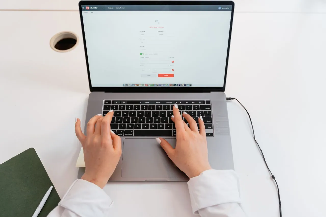
A call-to-action tells visitors what they can do next. If the CTA is hard to find, too generic, or placed only at the end of the page, potential leads may drop off. This can be frustrating because the visitor may be interested, but the website does not make the next step clear enough.
CTAs should appear after key decision points. After explaining a service, the page can offer a next step such as “View Our Work”, “Request a Consultation”, or “Send an Enquiry”. The wording should match the level of commitment you are asking for at that moment in the journey.
When reviewing website design services, SMEs should ask how CTA placement will be planned across the website. A good CTA is part of the user journey, not just a button appended to the page.
The number of CTAs also needs balance. Too few and visitors may miss the next step. Too many and the page can feel noisy and pushy. A good page usually has one primary action and a few supporting paths, such as viewing work or reading more about a specific service.
Long forms create friction at the wrong moment
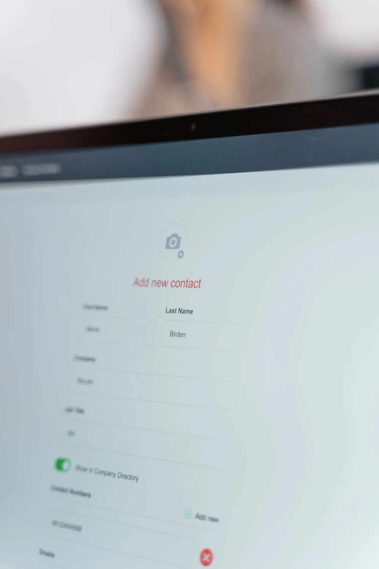
Long forms can hurt conversions because they create effort at the exact moment someone is ready to enquire. If a form asks for too many details too early, visitors may decide to come back later and then forget. This is especially true on mobile, where typing is less convenient.
A better approach is to collect what is needed for the first response. Name, contact details, company name if relevant, and a short message are often enough. More detailed discovery can happen during the follow-up conversation, once trust has been established.
Form usability also matters. Are fields easy to tap on mobile? Are errors explained clearly? Does the submit button work on small screens? Does the user receive confirmation after submitting? These small details can make the business feel more professional and organised.
Some businesses benefit from progressive enquiry flows. Instead of asking every question in one long form, the first step can be simple, with follow-up questions handled later. This feels lighter for the customer and can still give the business enough information to respond properly.
Mobile conversion issues can go unnoticed for a long time

Mobile conversion is often where SMEs lose opportunities without realising it. A page that looks fine on desktop may be difficult to use on a phone. Text may be too small, buttons too close together, menus confusing, or important content appearing too far down the page.
Mobile visitors are often task-focused. They want to check services, compare credibility, find contact details, or send a quick enquiry. If the page makes these actions difficult, they may move on to another provider before your team has a chance to speak with them.
A strong web design and development Singapore process should test the mobile journey properly — not just check whether the page fits on a screen, but confirm whether a real customer can understand, trust, and contact the business easily from that screen.
Mobile testing should be done on real devices where possible. A layout may look acceptable in a desktop preview but feel awkward on an actual phone. Tapping buttons, opening menus, and filling forms are the kinds of actions that reveal whether the mobile experience is truly comfortable.
Conclusion
Conversion problems are not always solved by a full redesign. Sometimes the most useful improvements come from fixing the small moments where visitors hesitate. Clear headlines, visible CTAs, simple forms, mobile-friendly layouts, and relevant trust signals can all make a practical difference.
A helpful first step is to review your website page by page and ask what a first-time visitor might be thinking. If the answer is unclear, the design may need to work harder. Improving these details can help turn more of your existing traffic into useful enquiries.
Want to turn more website visitors into enquiries? BlueCube reviews and improves SME websites, focusing on conversion, UX, and design clarity. Contact us to get started.
FAQs for Website Development for SMEs
What is website conversion?
Website conversion happens when a visitor takes a desired action, such as submitting an enquiry, booking a call, downloading a guide, or requesting a quote.
Why is my website getting traffic but no enquiries?
The issue may be unclear messaging, weak CTAs, poor mobile experience, long forms, missing trust signals, or service pages that do not explain value clearly enough.
Do design details really affect leads?
Yes. Small design details affect how easily visitors understand the business and take action. Friction in headlines, forms, CTAs, or mobile layouts can reduce the number of leads the website generates.
Should every page have a CTA?
Most important pages should have a clear next step, but the CTA should match the visitor’s stage of interest. Not every CTA needs to be a hard sell.
Can conversion improve without more traffic?
Yes. If the website improves how it guides existing visitors, enquiries can increase even without a major increase in traffic.
How do I know which conversion issues to fix first?
Start with the pages that get the most traffic but generate the fewest enquiries. Review the headline clarity, CTA placement, form length, and mobile usability on those pages first, as that is usually where the biggest gains are found.