4 Key UI/UX Best Practices for Your Website Revamp
Key Takeaways
- Effective UI/UX design begins with a deep understanding of user needs, behaviours, and business objectives validated through desktop research, not assumptions.
- Clear visual hierarchy directs user attention and helps them prioritise information, enabling faster decision-making and smoother navigation.
- Consistent and well-structured UI components (e.g. cards, buttons, forms) improve usability by making content easy to read and intuitive navigation hierarchy.
- Mobile-first design prioritises user’s key pathways and constraints on smaller screens, ensuring performance, clarity, and usability across all devices.
- High-quality UI/UX design focuses on usability, accessibility, and user flow. It directly impacts user engagement, designated pathway completion, and conversion outcomes.
Think about the last time you visited a website and left almost immediately. Maybe it was confusing to navigate. Maybe it looked outdated. Maybe you simply couldn’t find what you were looking for. Now think about a website that felt effortless — where everything was exactly where you expected it to be, and before you realised it, you found yourself making an enquiry or filling in the contact form.
That difference is UI/UX design at work.
- UI stands for User Interface: the visual elements of a website, such as buttons, layouts, and typography.
- UX stands for User Experience: how intuitive and relevant the overall user journey through the website feels.
Together, they determine whether a visitor stays, engages, and takes action, or clicks away and never returns.
If you are planning a website revamp, whether you’re doing it in-house or working with a UI/UX design agency in Singapore for corporate web design services, understanding these principles will help you make better decisions and achieve stronger outcomes. Here are four key UI/UX best practices to guide your project.
Designing for the User
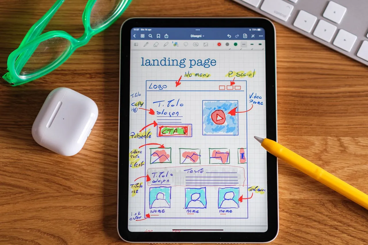
Every project starts with a client brief: a document outlining what the client wants their website to do. But a brief generally tells us what the client wants. It does not always tell us what the user needs. And ultimately, it is the user who decides whether a website succeeds or fails.
Before any design work begins, we ask an important set of questions, such as:
- Who is visiting this website?
- What are they looking for?
- What might stop them from finding it?
The answers shape everything from how pages are structured to where buttons are placed and what the website says.
We also map out user flows, the path a visitor takes through a website from the moment they arrive to the moment they take action. This ensures every page has a clear purpose and every step in the journey makes sense. There are no dead ends, no confusing detours, and no unnecessary friction between a visitor and the action we want them to take.
We strive for website design that is grounded in real user behaviour, not assumptions. The result is a website that delivers more than just visual appeal.
Visual Hierarchy and Guiding Attention

Most people are unaware of this, but every time you land on a webpage, your eye makes a series of decisions in a split second, like:
- What do I look at first?
- What is most important here?
- Where do I go next?
These decisions happen instinctively, and good design shapes them deliberately.
This is called visual hierarchy, and it is one of the most effective tools in a designer’s toolkit.
Typography plays a significant role. Large, bold headings grab attention first. Subheadings help users scan the page before committing to reading. Well-spaced body text keeps them engaged once they do. The size and weight of text signals clearly what matters most on any given page.
Colour works in the same way. A brightly coloured button on a neutral background immediately draws the user’s attention, while using a consistent colour palette across a website reinforces brand identity and gives the overall experience a cohesive, professional feel. Colour contrast also plays an important accessibility role — sufficient contrast between text and background ensures your content is readable for all users. To understand how accessibility fits into the broader web design process, read our guide on the role of accessibility in web design.
Spacing is often overlooked but carries considerable weight. Giving key elements room to breathe makes them stand out. On the other hand, crowding too many things together can overwhelm users and reduce the impact of every individual element on the page.
When typography, colour, and spacing work together with clear intention, users move through a page naturally, often without realising they are being guided at all.
Use UI Compenents like UI Cards
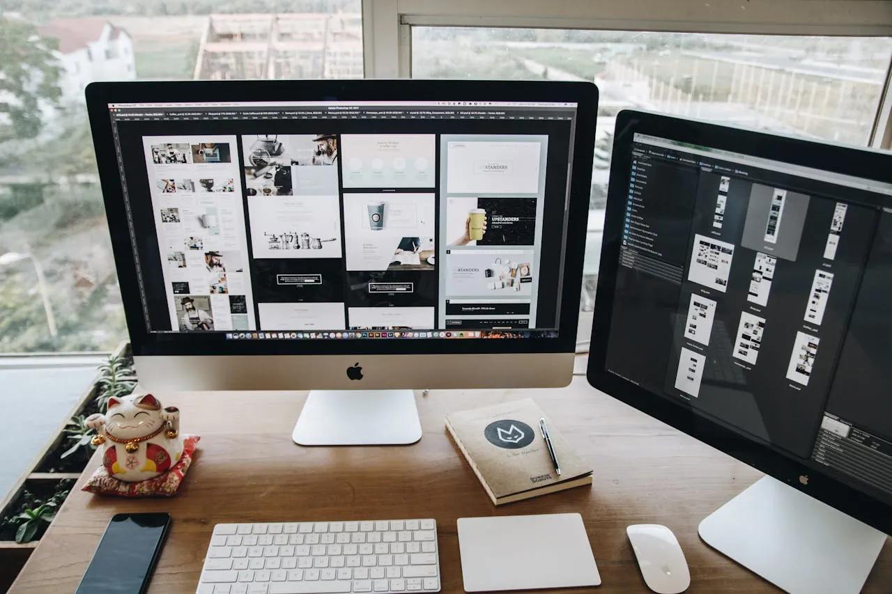
If you have browsed a website and noticed a neat grid of boxes, each containing an image, a title, a short description, and a button, you have seen UI cards in action. They are one of the most widely used components in modern web design, and when executed well, they are remarkably effective.
Cards work because they organise information in a format that is easy to read. Rather than reading through long blocks of text, users can browse a grid of cards and click on whatever is relevant to them. This lowers the mental effort required to navigate a page, keeps users engaged, and makes the overall experience feel more intuitive.
A well-designed card has four key elements: a relevant image that provides immediate visual context, a clear and concise headline, a short supporting description, and one unambiguous call to action. Simplicity is the priority.
There are also clear pitfalls to avoid. Multiple links within a card body create confusion about where to click – just one link will be perfect! Low-quality or irrelevant images undermine the credibility of the content they represent. Cards in different sizes or styles can make a page feel messy and unorganised, regardless of how strong the content is.
Here at BlueCube Media, we use and design card components that work consistently across the entire website, on desktop, tablet, and mobile, so that every page feels structured and easy to navigate, regardless of how much content it contains.
Mobile-First Design (Without Sacrificing Desktop)
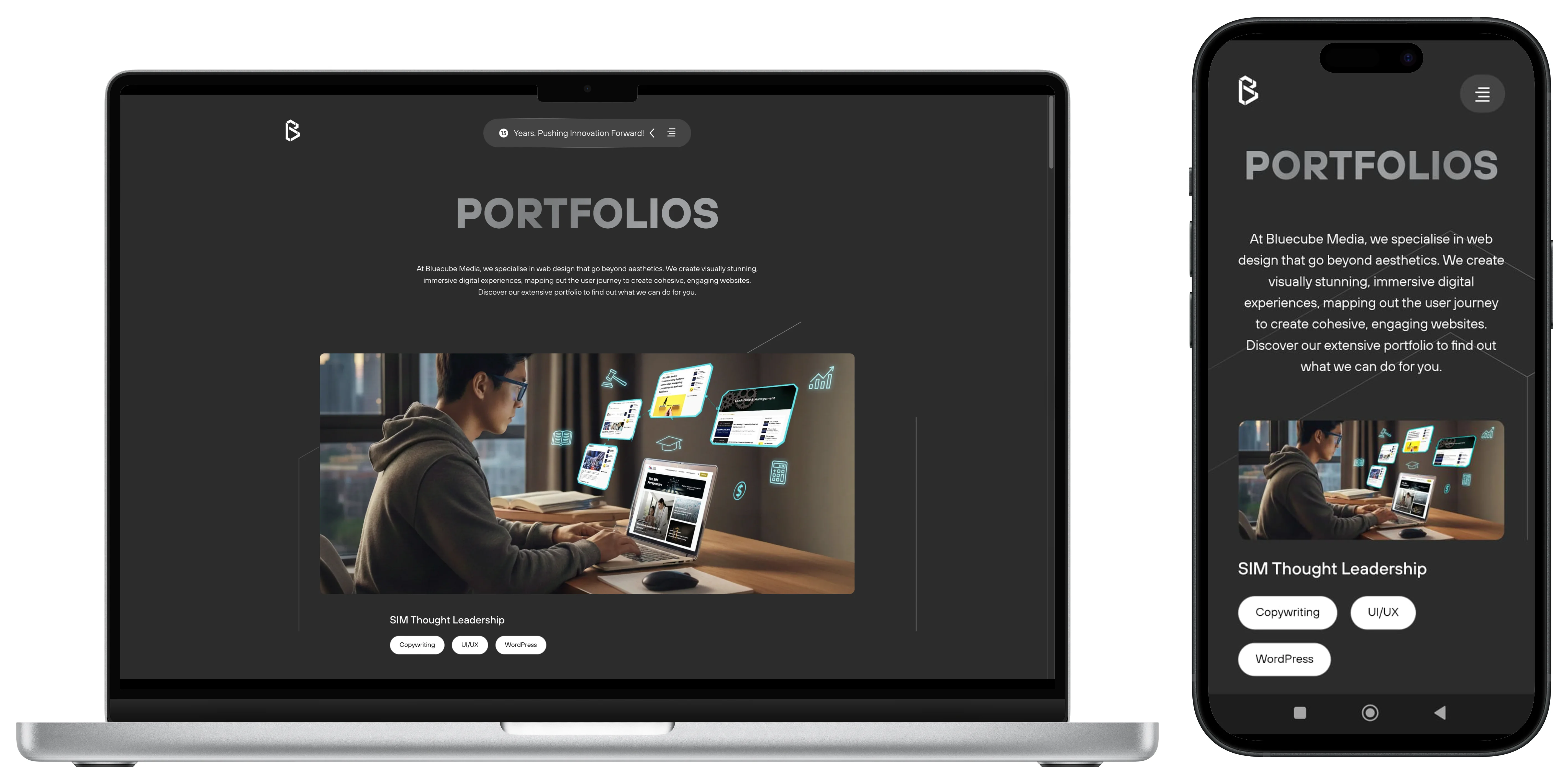
Mobile-first design is frequently misunderstood. It does not mean taking a desktop website and scaling it down. It means beginning the design process on mobile and building upward from there.
The reasoning is practical. Most web traffic globally comes from smartphones, and Google ranks websites based on their mobile experience first. A website that performs well on desktop but feels difficult to use on a phone is already losing users and search visibility before it has had a chance to make an impression.
Designing for mobile first also encourages better design decisions overall. Limited screen space means every element has to earn its place. Content gets prioritised. Navigation gets simplified. Load times get optimised. These constraints consistently produce cleaner, more focused outcomes that strengthen the desktop experience as well.
At BlueCube Media, we design for mobile, tablet, and desktop simultaneously rather than sequentially. Every version of the website is considered and purposeful, not just a resized adaptation of another. For a broader look at what makes a strong business website in Singapore, including mobile-first considerations, read our essential guide to website design.
Conclusion
The best UI/UX design tends to go unnoticed. When it works well, users move through a website with ease, find what they need without frustration, and leave with a positive impression of the brand. Achieving that outcome takes deliberate, user-centred thinking at every stage of the design process.
For Singapore businesses investing in a new website or a redesign, UI/UX design has a direct impact on business performance. A website that is easy to use, visually clear, and optimised across every device converts more visitors, retains more users, and supports long-term growth.
If you are looking for a website design agency in Singapore that treats UI/UX as a core part of every project, we would be glad to hear about yours. Get in touch with BlueCube and let’s build something that performs as well as it looks.
FAQs for UI/UX Web Design
1. What is the difference between UI and UX design?
UI (User Interface) design covers the visual elements of a website: layouts, colours, typography, and interactive components that users see and engage with.
UX (User Experience) design covers the overall journey through the website: how logical, efficient, and satisfying it is to navigate from one point to the next. The two disciplines are closely linked and work best when considered together from the start of a project.
2. Why does UI/UX matter for corporate website design?
UI/UX web design directly affects how users perceive a brand, how long they stay on a website, and whether they complete the actions a business wants them to, like submitting an enquiry, making a purchase, or signing up for a service. Poor UI/UX results in higher bounce rates, lower conversion rates, and a weaker overall brand impression. Working with a UI/UX design agency in Singapore that understands these dynamics can make a measurable difference to your outcomes.
3. What is mobile-first web design?
Mobile-first web design is an approach where the design process starts with the mobile version of a website before scaling up to tablet and desktop. Starting with the most constrained environment ensures that content is prioritised effectively and that the experience holds up across all screen sizes.
4. What are UI cards and why are they used?
UI cards are self-contained content blocks that group related information like an image, title, description, and call to action, all into a single visual unit. They make content easier to scan, reduce the user’s effort to navigate a page, and create a consistent, organised visual structure across a website.
5. How does BlueCube Media approach UI/UX design?
BlueCube Media’s UI/UX design process begins with understanding the end user: their behaviour, goals, and journey through the website. From there, we map user flows, establish visual hierarchy, design consistent components, and build responsively from mobile upward. Every decision is made with both the user experience and the client’s business objectives in mind.
6. How do I know if my website needs a UI/UX review?
Key indicators include a high bounce rate, low conversion rate, poor mobile performance, outdated visual design, or user feedback suggesting difficulty finding information. If a website is not delivering the results a business expects, a UI/UX review is a good starting point. A UI/UX design agency in Singapore can help you identify exactly where the gaps are.